 Scroll back to 2010, when websites were clunkier, slower and designed for desktop viewing only. We have come a long way in the last ten years, with rapid changes in design styles, digital marketing and WordPress advancements.
As the decade comes to a close, let’s take a look at the many milestones and innovations of the web industry in the 2010s, from mobile-responsive design to long-scrolling pages. In the world of the Internet, the only constant is change.
Web Design Recap: 2010-2019
2010
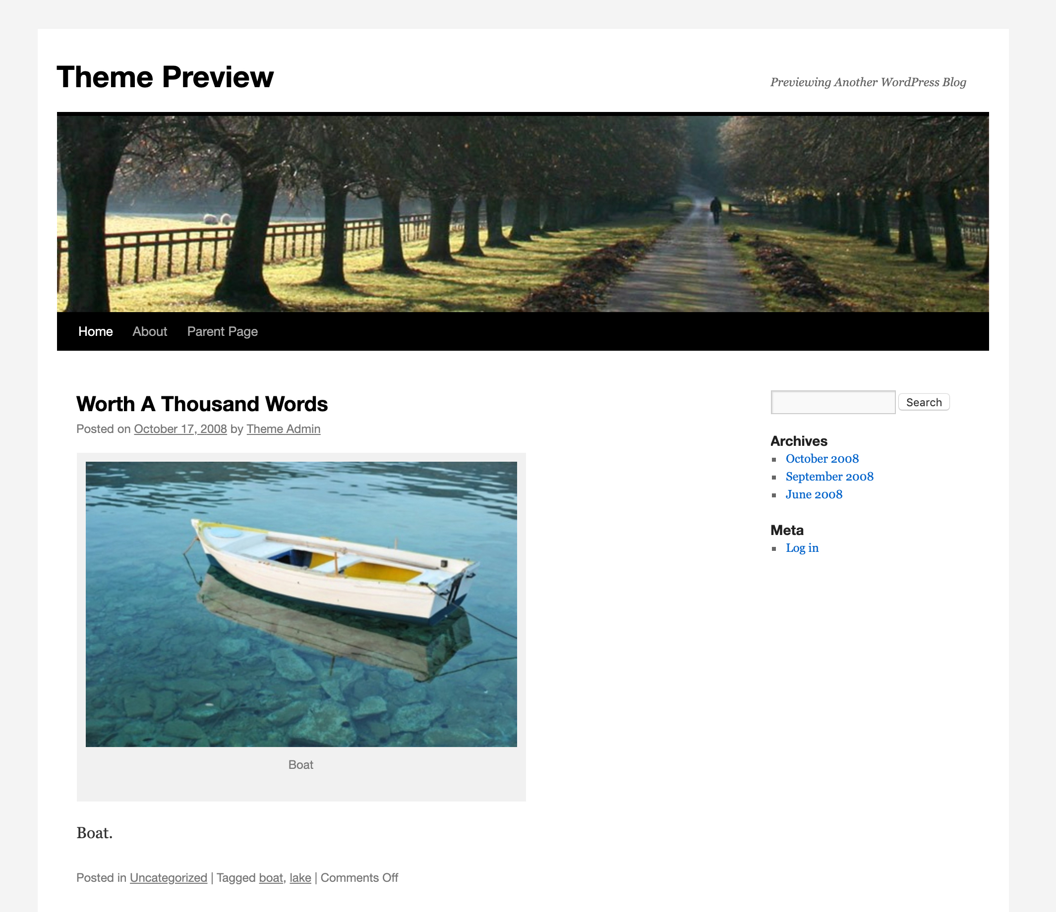 WordPress was just 7 years old in 2010 and it was still viewed more as a blogging platform than a full web solution. WordPress released the Twenty Ten default theme and you’ll notice from the theme preview pictured here that it has a classic blog design.
Today, we expect every website to be mobile responsive, but this wasn’t a thing in 2010. The term “Responsive Design” was introduced to the web industry in May 2010 and the majority of sites were still being designed for desktop only.
Highlights
- WordPress released the Twenty Ten default theme, starting a new tradition of releasing a new theme every year
- Apple released the first iPad
- The term “Responsive Design” is introduced for the first time
- WordPress 3.0 was released & included custom headers, background images & menus
- WP Engine, the premier WordPress hosting platform, was founded
2011

Then in 2011, we saw the release of WooCommerce, an e-commerce platform that integrated seamlessly into WordPress. Today, WooCommerce is the most popular e-commerce solution.
In design trends, websites were often designed with large side margins and you can see an example pictured here from Apple’s website in 2011.
Highlights
- WooCommerce e-commerce platform is released
- Web design trend of large side margins is still popular
- Major WordPress security breach due to Tim Thumb vulnerability
- Flat design style is introduced with the popularity of Microsoft’s Windows Phone 7
2012
Between 2011 and 2012, flat design became a popular web design trend. The style was introduced when Microsoft released Windows Phone 7 and 8, which featured a flat design interface. Flat design uses more two-dimensional objects, as opposed to the material, realism design trend of the early 2010s.
Website security was a big topic in 2012 after a major GoDaddy DNS hack caused millions of websites to go down.
Highlights
- Flat design style becomes popular web design trend
- GoDaddy DNS hack causes millions of sites to go down in September 2012
- WordPress introduced a new media manager, theme customizer and theme preview
2013
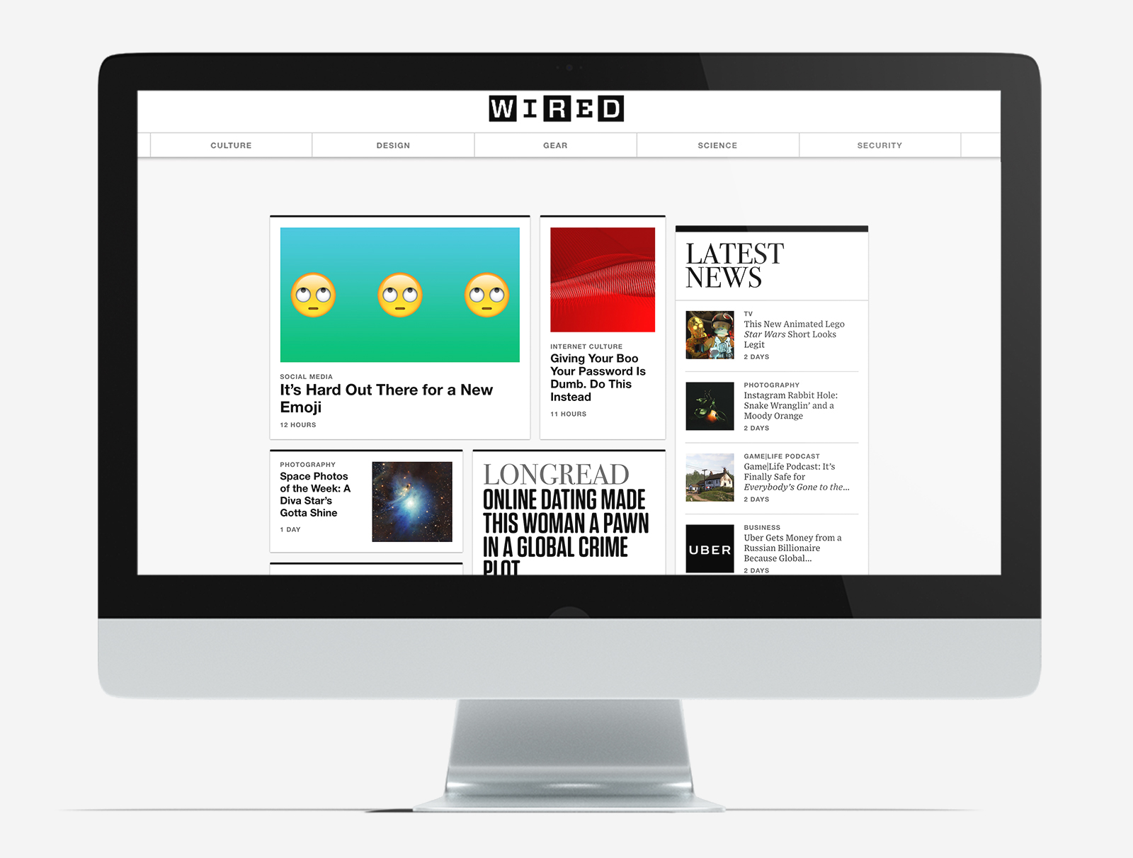
In terms of design, parallax was very popular in web design. Parallax is the effect where the position of an object appears to be different when you scroll on a web page. Another design style called “card based design” also became a big trend in 2012 and 2013, due to the popularity of social media platforms like Pinterest. It is still used by a lot of news websites such as Wired.com pictured here.
Highlights
- Card-based design introduced due to popular of Pinterest and social platform
- Parallax effect becomes popular web design trend
- WordPress has become the most popular CMS in the world
2014
A big milestone was reached in 2014. For the first time, more people in the world viewed websites on mobile devices instead of desktops. This statistic would usher in bigger changes in 2015 for mobile design.
In 2014, Google also rolled out new design styles with their products and this started the semi-flat design trend. Semi-flat design tried to combine flat, two-dimensional objects with realistic objects.
Highlights
- In 2014, Google rolled out new styles that got the name “material design” and this became the foundation of semi-flat design
- 1st time more people viewed websites on mobile devices than desktops
- Sticky navigation menus are used more in web design
2015

While most web design agencies were already using responsive technology in web designs, there was a huge rush this year to upgrade older sites to mobile-friendly platforms.
Highlights
- Google rolled out Mobilegeddon, the algorithm update that penalized sites that weren’t mobile-friendly
- WordPress vulnerability compromised several widely used plugins, including Yoast, Gravity Forms and Jetpack
- Microsoft releases the first version of Microsoft Edge
2016
The effects of Mobilegeddon were still felt in the web design industry in 2016. We also saw web visitors adopt a lot of mobile-viewing behavior, even when looking at sites on desktop devices.
Due to the popularity of social media, web visitors were accustomed to scrolling through long web pages. Long scrolling page designs became a modern style on websites.
Highlights
- Long scrolling web pages are adopted
- Hamburger menus start to be used on mobile and desktop sites
- Chrome and browsers require SSL certificates (HTTPS) to be enabled on all websites
2017

On the topic of interaction, Flash animations used to be one of the only interactive options on websites back in 2003-2005. Since then, flash has disappeared from all sites and in 2017, Adobe announced that Flash Media Player would no longer supported starting in 2020.
Highlights
- Hero images & videos were implement in web designs
- Hover over and interactive components are easier to implement
- Adobe announces that Flash will end and no longer be supported in 2020
2018

The second big news of 2018 was the Global Data Protection Regulation or GDPR, which went into effect in the E.U. as of May 2018. The GDPR set new standards for how websites and businesses should collect and retain data on their consumers.
Highlights
- WordPress releases 5.0 and Gutenberg editor
- Global Data Protection Regulation (GDPR) goes into effect
- Google releases mobile page speed algorithm update
2019

Web designers moved more towards micro-animations, which are small effects that support the action a user is taking on the site. Illustrations like the ones pictured here became more popular, although they require more design work.
Highlights
- Illustrations & micro-animations are popular trends
- Live chat and chat widgets are extremely popular
- PHP 7.2 migration required for WordPress sites
