Beware all website visitors of trickery, deception and sly gimmicks as you browse the web. There are websites out there that will guide you down an unintended path or fool you into taking an action that may not be in your best interest.
The vast majority of websites are designed with the best of intentions to create a positive experience for the user, but there is also a dark side of UX or user experience.
So, be cautious and alert in order to avoid falling victim to these murky tactics.
Common Examples of Dark UX
1. Bait & Switch
This trick is more commonly known as “click bait” and it occurs when content is presented in a misleading way in order to encourage a web visitor to click to a page. Once the visitor lands on that page, they realize the content isn’t what was promised.
Click bait is widely recognized as a bad practice and advertising platforms like Facebook have banned the use of such tactics.
While click bait may have worked in the past, it is an extremely damaging practice because it immediately creates distrust between a web visitor and your business/brand.
2. Guilt Tripping

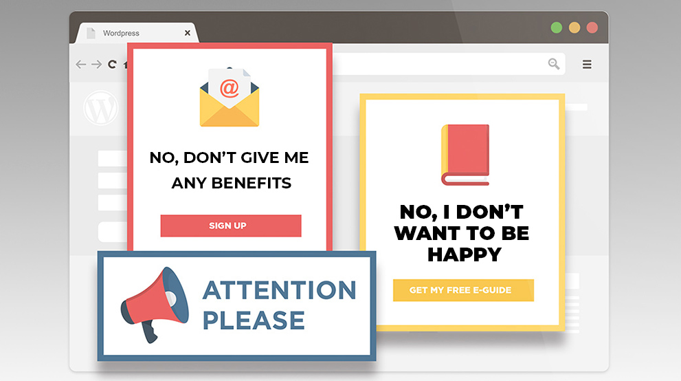
This would be a classic example of guilting or shaming a visitor into a specific action. Most of us see these types of messages and may laugh them off, but no one likes to feel shamed into something.
Similar to the other dark UX trends on this list, shaming a web visitor will never foster a positive engagement and establish trust.
3. Confusing Messaging
We often talk to clients about confusing messaging on their websites because it can happen by mistake. A lot of times we view the website navigation and messaging from our own point of view and industry knowledge, and it’s easy to forget that
Confusing messaging from the dark side of UX standpoint is more intentional with the goal of confusing the visitor to select a certain option.
There is a lot of discussion around messaging and privacy policies right now. One of the guidelines under the Global Data Protection Regulation (GDPR) is that website privacy policies need to be written in simple terms for web visitors to understand.
This regulation came about because a lot of websites previously had policies that were filled with cryptic terms and vague text, leaving web visitors confused on what data was being collected and what was done with it.
4. Hidden Information
Along with confusing visitors, hiding information is a manipulative approach, but we do see it on some sites.
Now, you shouldn’t have every last detail of information about your company, your products/services, and your team on the website. Your goal is to educate the web visitor enough that they feel comfortable to take the next step.
This dark UX tactic is referring to situations where you are purposely withholding critical information from a website visitor. A common example of this is with free trial sign-ups. While most free trials of a software or program will make the terms clear, there are those out there where it’s not stated when the trial ends or you have to hunt through the dense terms and conditions text to find out when you’ll be charged.
5. Trapping Users
Sadly, we’ve all probably experienced this last situation where you get trapped on a web page. The most common scenario is where a pop-up message appears and there’s no way to close out of the message.
There is always a final escape for web visitors in this scenario because they can close the browser and exit out of the website entirely. This is the worst way for a web visitor to leave your site where they are trying to escape.
The ethical practices for user experience (UX) design are focused on guiding a visitor to a path, but you always want to provide options. This is especially important if, like most websites, your site has different visitors coming to it with different goals.
Empathy Over Dark Tactics
On your own website, it can be easy to get caught up in what you want on the site. The best way to avoid slipping into dark tactics is to understand your web visitors. When you empathize with your visitors and focus on creating a site that fits their needs, then you are far less likely to turn to the dark side of UX practices.

