 A call-to-action (CTA) is a feature on your site that is designed to assist in the conversion of web visitors to actual leads. If it is created in an effective way, it can play a significant role in whether you capture or miss out on a potential client.
On most template-based finance sites, the call-to-action buttons or features are typically very weak and will link to a generic contact page with a submission form.
We’ve found that our clients see much better results with a high-quality custom designed CTA page with a unique offering that attracts leads who are the best fit for their services.
Create a Strong CTA Page for Your Niche
A CTA or ‘Conversion’ page is typically a custom designed web page that is different from and more robust than a standard contact page. It typically tells a story about your firm and the benefits of your services along with a compelling reason as to why the visitor should take the next step and reach out to you.
In order to offer the appropriate CTA that will best fit the needs and goals of your visitors (potential clients), you first need to understand your niche.
1. Make the Offering Relevant to Your Niche
During a website project, we spend a lot of time with our clients identifying the types of different visitors to their site and crafting and designing a CTA that fits the site and business goals.
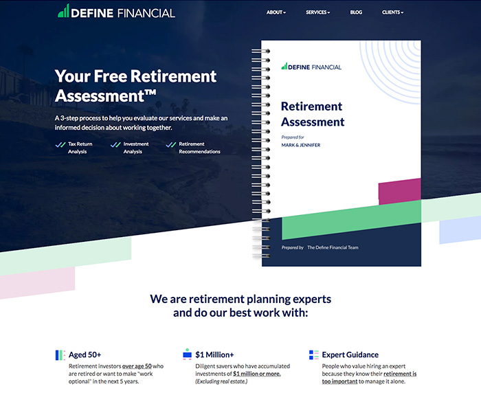
For example, the custom CTA page on Define Financials’ website, pictured below, highlights their Free Retirement Assessment.
All of the messaging and design on this page tells visitors what they will get from the assessment, the process involved, and the first step to take with a link to schedule a call.
2. Tell a Story with a Custom Design
Because you’ll be driving the majority of visitors to this page, we always recommend creating a very high quality, custom designed CTA page.
With a unique mockup, you can leverage a high-quality design to tell a story, walk through your process, and build an emotional connection with visitors.
If you have a form on the page or a link to book a call, these design elements should stand out and draw the visitors’ attention.
3. Use the Messaging to Qualify Visitors
In addition to attracting your ideal clients, the CTA page should help weed out those visitors who aren’t the best fit for your services.
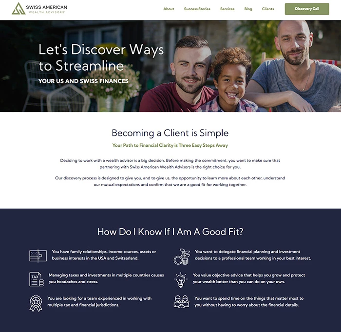
For example, the CTA page on Swiss American Wealth Advisors website has a dedicated “How Do I Know If I am a Good Fit?” panel, as pictured below.
The messaging on the CTA page can also address common questions in an FAQ section, so you can address any concerns that could be deterring visitors from converting.
4. Track the Results
Another advantage of creating a dedicated Call to Action page is that it can help with conversion tracking. In Google Analytics, you can set up a goal tied to a unique thank you page for the form on the call to action page.
If you are guiding visitors to schedule a call on a booking calendar, you may need to review the tracking setup on the calendar system like Acuity or Calendly.


