 In most cases, you only have 1 chance to make a strong first impression and connect with your visitors.
If the ball gets dropped, there is a very good chance that you could miss out on a lead and a potential client.
The Call-to-Action is typically the tool that converts a web visitor to a lead. We’ve found that you can boost conversions by creating a custom Call-to-Action or CTA page that tells a story and is much more than just a contact form.
What is a Call to Action Page?
On most websites, the call to action buttons and messaging will link to the contact page with a form and contact details.
A call to action page is a custom page design that is different from the contact page, and the CTA page:
- communicates the value of what you are offering
- shares the process & what to expect next
- starts to qualify leads & address common questions

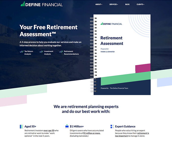
The CTA page on Define Financial’s site above is a great example of how the messaging and design of the page achieves these goals and guides visitors to schedule a free retirement assessment.
How to Design a High-Converting CTA Page
Since you’ll be driving visitors to the CTA page as the final step in their journey, the design and messaging of the page are extremely important.
During website projects, we’ll typically work with clients on the messaging for the call to action buttons and design a custom mockup for the CTA page.
With a custom CTA page design, you can:
- Use design elements and interactive components to support the messaging
- Tell a story that engages visitors & creates an easy flow to the page
- Make it very user-friendly for visitors to easily fill out a form or schedule a call

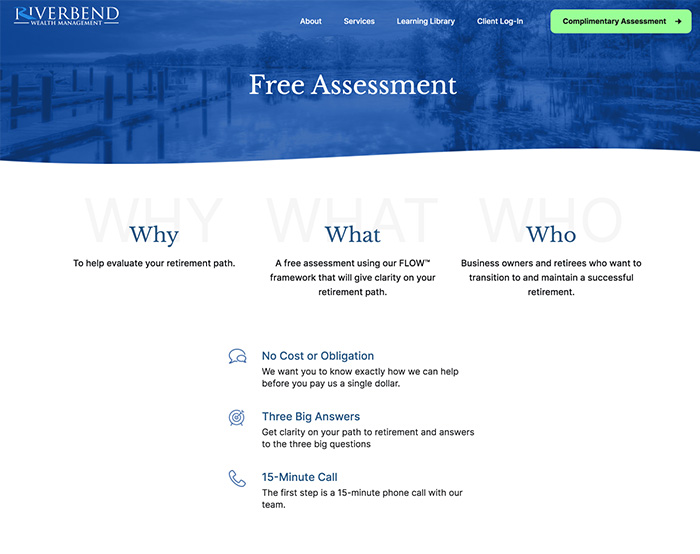
Your CTA page can also help you qualify visitors and set up clear expectations for the first call. For example, Riverbend Wealth Management’s custom CTA page uses the messaging design elements to explain the complimentary assessment call.
