How to Grab Your User’s Attention on Your Website
In 2026, the average attention span online is roughly eight seconds. Your website needs to immediately communicate value and guide visitors to the most important information. The good news? Web users behave predictably, and understanding these patterns allows you to design sites that capture attention strategically.
Here are proven strategies for focusing your visitors’ attention on the most important areas of your website. Images are more eye catching than text. Bolded text stands out more than plain text. Web users instantly recognize patterns, edges, and motion. You can use all of these principles to create websites that guide visitors exactly where you need them to go.
The Psychology of User Attention
Understanding how people actually look at websites is the foundation of effective attention design.
How Users Scan Websites
Eye tracking studies show web users scan rather than read. The F-pattern is most common: users read the top horizontally, scan down the left side vertically, then make shorter horizontal sweeps when something catches their attention. The Z-pattern appears on pages with more visual elements and less text.
These patterns mean top left gets the most attention, the left side gets more views than the right, and the first few lines of text matter far more than anything below the fold.
Attention Spans and Decision Fatigue
People arrive at your site with limited mental energy. Every unclear element or piece of irrelevant information drains those resources. Focused, clear design outperforms busy, cluttered layouts because it reduces cognitive load and makes the path forward obvious.
Pattern Recognition
Human brains recognize patterns, edges, and motion instantly. Sharp edges and clear boundaries draw attention. When something breaks an established pattern, it stands out immediately. Even subtle movement captures focus, which is why animations work when used sparingly but overwhelm when overused.
Visual Hierarchy Fundamentals
Visual hierarchy is the arrangement of design elements to show their order of importance. Creating effective visual hierarchy is a fundamental principle of user-friendly websites that guide visitors naturally to the most important content.
Size and Scale
Bigger elements attract more attention. Your headline should be larger than body text. Important buttons should be larger than secondary ones. Be deliberate about size relationships. If everything is big, nothing stands out.
Color and Contrast
High contrast draws the eye. A red button on a white background gets more attention than a gray button. The greater the contrast between an element and its surroundings, the more it commands attention. This is why call-to-action buttons often use colors that do not appear elsewhere on the page.
Position and Placement
Elements at the top of the page get more attention than those at the bottom. Items on the left get more attention than items on the right. Above the fold (visible without scrolling) remains the most valuable real estate on your page.
Whitespace
Empty space around an element makes it more prominent. Whitespace is not wasted space. It is breathing room that lets important elements stand out and reduces visual noise. Strategic whitespace guides attention by creating visual separation and emphasis.
Typography and Formatting
Bold text stands out more than regular weight. Larger fonts command more attention. Underlining, italics, and color changes all signal importance. But these tools lose power when overused. Reserve formatting emphasis for truly important elements.
Above the Fold Strategy
Above the fold content appears immediately when someone lands on your page. Below the fold requires scrolling. While users do scroll, many bounce without scrolling if they do not immediately see value.
What Belongs Above the Fold
Clear value proposition: Visitors should immediately understand what you do and for whom. Be clear and specific, not vague or clever.
Primary call to action: What is the one thing you most want visitors to do? That action should be obvious and accessible above the fold.
Trust signals: Include at least one credibility element (testimonials, client logos, certifications) in the initial view.
Navigation: Clear, accessible navigation helps visitors orient themselves.
Mobile Considerations
On mobile, the fold is much higher and varies by device. This makes above-the-fold strategy even more critical. Prioritize ruthlessly for mobile. Essential information only above the fold.
Strategic Use of Color
Color is one of the most powerful attention tools. Different colors trigger different emotional responses and behaviors.
Call-to-Action Button Colors
Red, orange, and bright green are common CTA colors because they create urgency and stand out on most backgrounds. But the best CTA color is one that contrasts strongly with your site’s primary color scheme. A blue button on a blue site disappears. The same blue button on an orange site dominates attention.
Color Psychology Basics
Red: urgency, excitement, passion. Orange: friendly, approachable, affordable. Yellow: optimism, attention grabbing, caution. Green: growth, health, nature, go. Blue: trust, stability, professionalism. Purple: luxury, creativity, spirituality. Black: sophistication, power, formality.
Use color strategically, not arbitrarily. Your primary CTA should use a color that stands out. Secondary actions can use more muted colors. Background elements should recede visually through color choice.
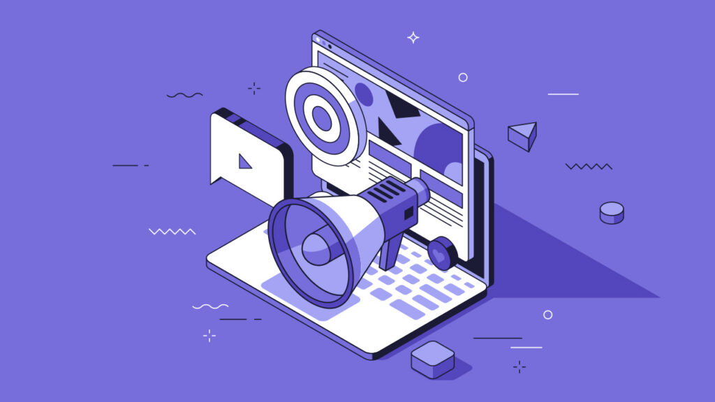
Images and Visual Media
Images are far more eye catching than text. People process visual information faster than written content, making images powerful attention tools.
Hero Images and Videos
A strong hero image or video at the top of your page immediately sets tone and captures attention. Hero images should be high quality, relevant to your message, and not so busy they distract from your headline and CTA.
Strategic Image Placement
Images of people draw attention, especially faces and eyes. People automatically look where photographed subjects are looking. If a person in your image looks at your headline or CTA, visitors’ eyes follow. Use this to guide attention deliberately.
Icons and Graphics
Icons can direct attention and make information easier to scan. Use icons to break up text, highlight features, and create visual interest. But avoid decorative icons that add clutter without meaning.
Designing Effective Calls-to-Action
Your call-to-action is often the most important element on the page. It deserves special attention to design and placement.
Button Design
Make buttons look clickable. Use shadows, borders, or 3D effects that signal interactivity. Flat design is fine if the button still clearly looks different from non-interactive elements.
Size matters. Your primary CTA button should be large enough to notice immediately but not so large it feels aggressive. On mobile, buttons need to be large enough to tap easily (minimum 44×44 pixels).
Button Copy
Use action-oriented, specific language. Instead of generic ‘Submit’ or ‘Click Here’, use ‘Get Your Free Quote’ or ‘Start Your Trial’. Tell people exactly what happens when they click.
Placement and Repetition
Place your primary CTA above the fold, but also include it below key sections of content. People convert at different points in their decision process. Multiple CTA placements accommodate different visitor readiness levels.
One example would be a contact form. Say you want people to contact you right away. Simple strategies include making the form stand out in size or color, placing it above the fold so visitors see it immediately, or emphasizing key words like ‘Free’ in ‘Contact Us for a Free Consultation’. All of these approaches focus attention on the action you want users to take.
Motion and Animation
Strategic use of micro-animations can draw attention to key elements without overwhelming users. Even subtle movement captures focus immediately, making animation a powerful tool when used thoughtfully.
When to Use Animation
Loading indicators keep users informed during wait times. Hover effects on buttons provide immediate feedback. Scroll-triggered animations can reveal content progressively. Subtle pulsing or highlighting can draw attention to important CTAs.
When to Avoid Animation
Do not animate multiple elements simultaneously. Do not use animations that repeat continuously. Avoid animations that obstruct content or delay access to information. Always respect user preferences for reduced motion.
Common Attention-Killing Mistakes
Certain design choices actively harm your ability to capture and direct attention.
Visual Clutter
Too many competing elements fighting for attention means nothing gets attention. Every additional element you add divides focus. Be ruthless about removing anything that does not serve a clear purpose.
Competing Calls-to-Action
Multiple equally prominent CTAs confuse users. Decide what matters most and make that dominant. Secondary actions should look secondary. If everything is a priority, nothing is.
Banner Blindness
People have learned to ignore anything that looks like an advertisement. Avoid banner-like placements at the top of pages. Avoid stock photos of overly attractive people pointing at text. These trigger automatic ignoring.
Unclear Information Hierarchy
When everything looks equally important, users do not know where to start. Headlines should be clearly larger than subheads. Subheads should be clearly larger than body text. Important elements should stand out visually.
Ignoring Mobile Experience
What works on desktop often fails on mobile. Small text becomes unreadable. Intricate designs become cluttered. Hover effects do not work. Test on actual mobile devices and prioritize mobile user experience.
Accessibility and Inclusive Attention Design
Capturing attention should not exclude users. Design that works for everyone is design that works better for everyone.
Color Contrast for Accessibility
High contrast helps everyone, not just people with vision impairments. Meet WCAG standards (4.5:1 contrast ratio for normal text, 3:1 for large text). Use tools to verify your color combinations meet accessibility requirements.
Alternative Attention Cues
Do not rely solely on color to convey importance. Use size, position, icons, and text labels as well. Someone who cannot distinguish red from green should still understand your visual hierarchy.
Respect Motion Preferences
Some users experience discomfort or illness from motion on screen. Respect the prefers-reduced-motion setting and provide static alternatives to animated content.How to Grab Your User’s Attention on Your Website
Frequently Asked Questions About WordPress Hosting
Q: What is the most important area of a webpage?
The top left corner typically receives the most attention in left-to-right reading cultures. This is where users start scanning, making it prime real estate for your logo, headline, or key message. However, the most important area depends on your specific goals. For conversion-focused pages, your primary call-to-action placement matters more than following any single rule.
Q: How many calls-to-action should a page have?
One primary call-to-action should dominate, with secondary options clearly subordinate. Multiple equally prominent CTAs confuse users and reduce conversion rates. You can repeat the primary CTA in multiple locations (top, middle, bottom of long pages), but it should be the same action. Secondary CTAs like navigation links or less critical actions should look less prominent.
Q: Does above the fold still matter with modern scrolling behavior?
Yes. While users do scroll more than they used to, many still bounce without scrolling if they do not immediately see value or relevance. Above the fold is your first impression and your chance to communicate what you offer and why visitors should care. Think of it as the cover of a book. People might read past it, but only if it captures their interest first.
Q: What colors work best for call-to-action buttons?
The best CTA color contrasts strongly with your site’s primary color scheme. There is no universally best button color. Red, orange, and green are popular because they stand out on many backgrounds and create urgency. But a blue button on an orange site will outperform an orange button. Test what creates the strongest contrast with your specific design.
Q: Should important content always be above the fold?
Your most important message and primary CTA should be above the fold, but not all important content needs to be. Once visitors are engaged, they will scroll for more information. Use above the fold to capture interest and communicate core value, then provide depth and details below. Think of it as an inverted pyramid: most critical information first, supporting details follow.
Q: How do I grab attention without being annoying?
Focus on clarity and helping users accomplish their goals rather than forcing attention through aggressive tactics. Avoid pop-ups that immediately block content, autoplay videos with sound, flashing elements, or anything that interrupts the user’s intent. The best attention-grabbing design guides naturally rather than demands. Respect your visitors’ time and intelligence.
Q: Do images always draw more attention than text?
Generally yes, but not all images are equal. Relevant, high-quality images that support your message draw positive attention. Generic stock photos often get ignored (banner blindness). Images of faces and people especially draw attention, particularly when the photographed person is looking at something you want users to see. Decorative images without purpose can actually distract from important text.
Q: How do visual hierarchy and accessibility work together?
They complement each other. Good visual hierarchy uses multiple cues (size, color, position, contrast) to show importance. This redundancy helps everyone, including people with various disabilities. Someone who cannot see color can still understand hierarchy through size and position. Someone using a screen reader benefits from proper heading structure. Design that is accessible is often clearer for everyone.
Q: Should mobile and desktop pages use the same attention strategies?
The principles are the same but the execution differs. Mobile screens are smaller, so you have less space and must prioritize more ruthlessly. Touch targets need to be larger. Hover effects do not work. Mobile users are often multitasking or distracted, so clarity and simplicity matter even more. Test both experiences separately and adjust for each platform’s constraints.
Q: How often should I use animation to grab attention?
Sparingly. Animation is powerful but easily becomes overwhelming. Use it for specific purposes: showing loading progress, providing feedback on interactions, or drawing attention to one critical element. Avoid animating multiple things simultaneously, constant motion that never stops, or decorative animations without clear purpose. Always respect the prefers-reduced-motion setting for users who find motion uncomfortable.
Final Thoughts: Strategic Attention Design
Capturing and directing user attention is not about tricks or manipulation. It is about respecting your visitors’ time and making it easy for them to find what they need. Understanding attention principles is essential to effective website design and development that converts visitors into customers.
When you understand how people scan websites, what visual elements draw their eyes, and how to create clear hierarchy, you can design experiences that feel intuitive and helpful. Users appreciate sites that make their path forward obvious.
Ask yourself with every design decision: what areas of this page do I want visitors to focus on? Then use size, color, position, contrast, whitespace, and imagery to guide them there naturally. Do not make users work to figure out what matters. Show them clearly.
Start with your most important message and action above the fold. Use strong visual hierarchy to make importance obvious. Employ color strategically to create contrast. Include clear, specific calls-to-action. Test on mobile devices. Remove anything that does not serve a clear purpose.
Most importantly, design with empathy. Consider how real people with limited time and attention will experience your site. What will help them succeed? What will frustrate them? Design that answers these questions will naturally capture and hold attention.
Need help designing a website that captures attention and drives results? Contact TinyFrog to discuss strategic web design that guides users exactly where you need them.