
10 Outstanding B2B Website
Design Best Practices from
Web Design Experts
As a B2B business, your website serves a critical role in your marketing and lead generation. Therefore, creating an effective B2B website design first requires a critical understanding of your web visitors’ psychographics, mindset, and visit intent.
The B2B sales cycle is typically longer and more complex since a purchase decision often requires approval from multiple stakeholders and takes diligent research to find a solution aligned to the company’s needs, timeline, and budget. Because of this, the majority of web visitors aren’t ready to contact your team or make a purchase yet.
In order to engage web visitors, your website needs to:
- Establish trust & credibility
- Clearly define your value proposition
- Provide informative content
- Call visitors to action
Table of Contents
10 Outstanding
B2B Website Designs
B2B Website Design
& Development Tips
B2B Website Content
& Marketing Tips
1. Understand Your Web Visitors for the Best User Experience
If you don’t understand the mindset and intent of your web visitors, then how can you create a site that engages them?
A lot of businesses make the mistake of building a website from the “inside-out.” The company stakeholders all get together and decide what they want on the website. The problem with that approach is that you aren’t considering the needs and motivations of the people who will be using the site – your web visitors.
Build Your Website from the Outside-In
Empathy is the key to an effective B2B website design. Start by identifying the different classes of web visitors to your site through both quantitative and qualitative research.
- Quantitative: Reviewing website analytics for the various segments of web visitors and analyzing visitor behavior with heat maps or visitor recording
- Qualitative research: Talking to your team members who communicate with prospects day-to-day. Those team members typically have a lot of valuable information on the types of questions asked, the concerns that are voiced, and the goals that are expressed by your prospective clients.
When reviewing analytics, it’s important to have an objective in place in order to give meaning to the metrics. For example, are you trying to drive web visitors toward viewing your service or product pages? If so, keep track of the site traffic these pages get each month, and conduct a more thorough assessment if you notice the numbers are lower than preferred.
Additionally, you may want people to convert from visitors to leads by submitting a contact form or requesting a demo. Keep a close eye on the number of web visitors who complete this action.
Reviewing the key metrics that make sense to your business will not only allow you to track changes over time, but also make it easier to ensure your website has the best user experience possible.
If important pages have a high bounce rate (i.e. people are leaving after a second or two), reassess the content, design, and structure of those pages. You can perform A/B testing to see if changing one or two elements improves the page’s performance.
Spotlight Site: Patpatia & Associates
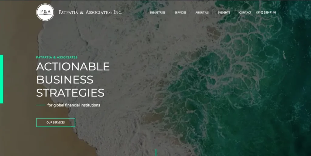
Patpatia & Associates is a great example of a website that focuses on the needs of their different web visitors. In addition to the captivating video design, the website home page articulates who they are and who they serve.
The industries section of the website highlights their expertise in working with specific professional services, and the Insights section offers engaging content from in-depth case studies to white papers for web visitors who aren’t ready to contact their team yet.
B2B Web Design & Development
Get a Free Web Consultation
2. Make Your Site Relevant to the Customer Journey
For B2B websites, the majority of web visitors are not ready to talk to your team right away. Your visitor typically has other needs and questions that need to be met first, such as:
- Am I in the right place? Can I trust this company?
- Is this the right product/service for me? What value would it bring me?
- Does this company have the solutions and experience that I need to solve my problem?
- What do I need to do to make an informed decision?
- Are there others like me that have made this same decision?
- What would a partnership or engagement with this company look like?
The solution is to understand your web visitor’s intent and customer journey. But before you can do that, you must first define the different types of web visitors. Similar to marketing personas, these “visitor profiles” are groups of people within your target audience that have similar goals, experiences, and situations. To define and understand these visitor profiles, you want to assess:
- The situation that led someone to your website. Perhaps they saw your company’s booth at an event, found you from a Google search, or heard about you from one of your current clients. Understanding this can help you determine their level of knowledge of your company.
- The goals and concerns they have as they navigate your website and ultimately make a decision. Determine what they want to accomplish, what information they’re looking for, and what might get in the way of them finding a solution.
- The key questions they have about your company’s experience, services, and process. You want to either directly or indirectly answer their questions throughout your website’s content, which not only helps them achieve their goals but shows that you have the knowledge and experience to help them.
- Awareness
- Consideration
- Decision Making
A customer journey map can then guide you on the structure of your website, helping you create an intuitive site navigation and relevant, personalized content.
Your website’s navigation is an extremely important factor in the overall web experience. A confusing website navigation with tons of pages and options can overwhelm a visitor. If you do need a lot of pages in the top navigation because you have many different services, products, or industry verticals, consider a mega menu instead of a long list of drop downs that are cumbersome to navigate.
By creating visitor profiles and custom journey maps, you can also update your website’s navigation to better align with the paths that different types of web visitors might be on. For example, perhaps you offer services for different types of companies or industries. You can title the pages in your navigation in such a way that it guides different visitors down the most applicable path.
Spotlight Site: Nelson Recruiting
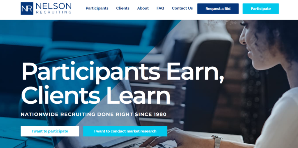
Nelson Recruiting is a nationwide market research and recruitment firm, and their website offers content for both companies in need of recruitment or research and people interested in participating in a focus group.
From the page titles in the navigation to the call-to-action buttons and home page structure, the website makes it very clear which content is applicable to which audience type. The site’s content is straightforward yet personal, which shows web visitors that Nelson Recruiting clearly understands who their target audience is and what they’re looking for.
3. Use Storytelling in Your Design Practices
Every business has a story to tell, and there’s no better place to do so than on your website.
Storytelling is one of the best ways to differentiate your brand and on your site, it can make your content more memorable and can help you establish an emotional connection with visitors.
A skilled web designer can convey a story in your B2B website design through the use of:
- Colors & fonts
- Imagery & video
- Animations & interactive components
- Visual hierarchy & spacing
Every image on the site can either support or hinder your overall message to visitors. Colors are an extremely powerful tool and can elicit an emotional response from visitors. The colors and fonts on your site can also set a specific tone, such as playful and friendly or serious and powerful.
Your web design should also use spacing and visual hierarchy to guide visitors’ eyes and make content easier to read. Visual hierarchy refers to the arrangement of elements in a way that conveys levels of importance. On a website, a designer uses fonts and different sizes to arrange content in a way that guides visitors from headings to subheadings in the right order.
Spotlight site: Adamo Security Group

For over 50 years, Adamo Security has specialized in the design, construction, modular fabrication and installation of high-security facilities.
During that time, their team has maintained an impeccable reputation and created a culture of adaptation and innovation.Their website tells this story of expertise and innovation through a modern design, black and white imagery reminiscent of construction blueprints, and subtle micro-animations.
The SCIFs & Secure Facilities pages features a custom design, which visually walks through the standards and requirements for Sensitive Compartmented Information units.
4. Define Your B2B Value Proposition
Most B2B businesses have a mission statement and value proposition for the overall company. However, you don’t have a lot of time on a website to make an impact on a web visitor.
On a B2B website, your goal is to capture their attention and show your value in a concise and powerful way…within a few seconds. The best way to do this on a site is to create a strong web-based value proposition, which states:
- Who you are
- What you do
- How you differentiate yourself
- And what are the next steps
Your web-based value proposition is typically only a few lines and it should be on the home page, in a prominent place since most web visitors will come to your home page first. However, the value proposition isn’t just the text. Your web designer can convey that value proposition through the messaging, imagery, and functionality on your site.
Spotlight Site: Link Revenue Resources
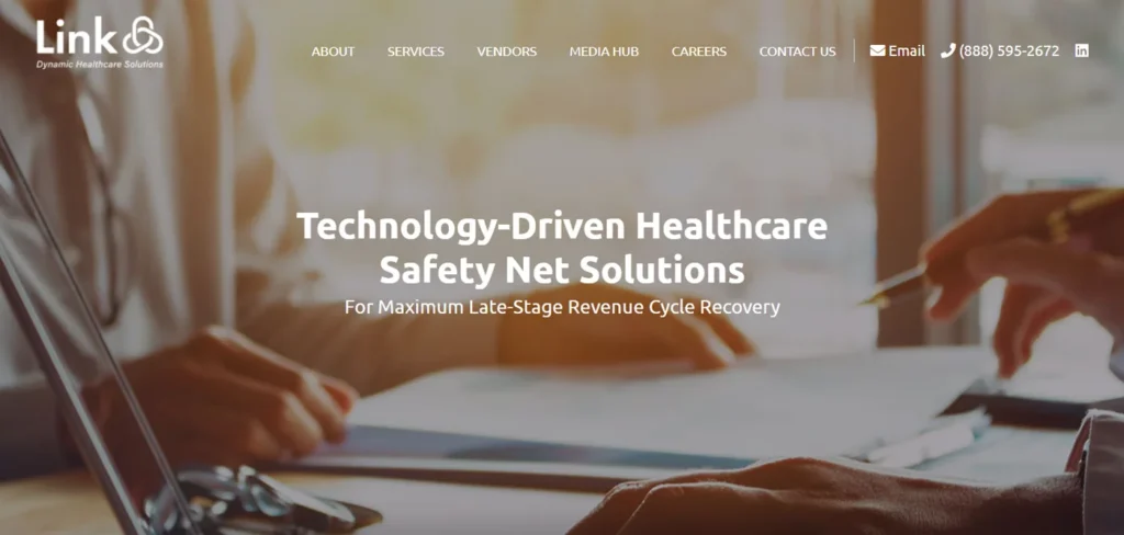
Link Revenue Resources, a technology provider in the healthcare industry, has a strong value proposition on their website. On the home page design, you’ll see the text “Technology-Driven Healthcare Safety Net Solutions” as the main headline. This clearly articulates who Link Revenue Resources is and what they do.
The rest of the messaging on the home page addresses the other parts of the value proposition, such as what differentiates their solutions, who they serve, and where visitors can go next to learn more.
5. Nurture B2B Leads with Calls to Action
Calls to action guide visitors to the next step on your website. As previously mentioned, an important part of a web-based value proposition is telling a visitor the next steps to take.
A call to action is typically a button or link to another page or section of the site. On a B2C website, the calls to action may be to “Buy Now” or “Add to Cart.”
However, the first call to action in a B2B website design is typically “Learn More” with a link to a product or service page. Remember that the majority of visitors are not ready to talk to your team immediately and are looking for more information first.
Without any calls to action, a visitor may get lost or leave the site before taking the right step. Depending on your different web visitors and customer journey, you may need different calls to action throughout the site that fit the needs and end goal for each visitor class.
Spotlight Site: Velocity WMS

International Data System’s website for their warehouse management software system, Velocity WMS, has several calls to action throughout the site. On the home page, you’ll see the call to action Product Overview which guides a visitor to the product page for the software system.
In the top navigation, there is another call to action, Request a Demo, button. This allows a visitor to take the next step once they are ready and have reviewed all the product information.
6. Establish B2B Trust & Credibility
If you land on a website and it’s a business you’ve never heard of, do you trust the company right away? Probably not.
Skepticism is a common trait of even the most accepting web visitors. In the B2B space, even if someone is referred to your company, they’ll typically look at your website first and they will judge the business by the site content and design.
For a B2B website design, the goal is to establish a baseline of trust so the visitor stays on the site and feel comfortable enough to take that first step in the lead generation process.
There are different types of trust and it’s best to include several of these types on your website in order to establish credibility:
- Visual Trust – this is formed based on the look and feel of the site. A high-quality design can support this while an outdated site can convey the wrong impression that your business isn’t focused on its online impression and isn’t on top of the latest trends
- Industry Trust – this can be conveyed through awards, affiliations and brand recognitions.
- Transactional Trust – this is formed based on trust symbols such as security protocols and privacy. Even if a visitor isn’t making a transaction on the site, they are looking to see if it’s safe to stay on the site and submit their information.
- Longevity Trust – this is based on how long your company has been in business or how many customers you’ve worked with in the past.
Spotlight Site: PRA System
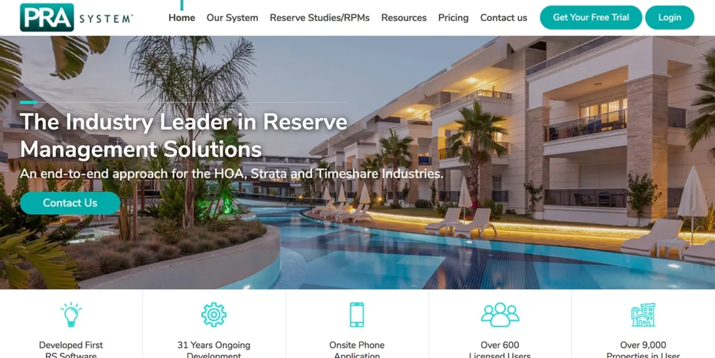
As the first distributable reserve management plan software, PRA System is an industry leader in reserve management solutions for the HOA, Strata and timeshare industries.
PRA System’s website establishes trust and credibility with web visitors in numerous ways. In the second panel of the home page, key statistics and features of the software are highlighted.
Further down the page, testimonials from top HOA and timeshare industry providers along with a rotating logo panel of the top companies utilizing the PRA system. All of these elements visually build credibility for the software and guide visitors to request a free trial.
7. Emphasize Your Products/Services with Custom Design
For a B2B business, your product or service page is typically the second or third most visited page of the site. For this reason, the page is often called a mission critical page, meaning it is critical to the customer journey on the site.
The best B2B websites elevate their product or service page by creating a custom page design. Most sites will have a custom home page design and then use a universal template for internal pages. With a custom design, a designer can create a powerful display that fits your products or services.
Remember that the call to action on a B2B website design usually guides a visitor to a service or product page, so your content on this page should address the main visitors in the B2B space are searching for more information. They are looking to answers on the basic questions:
- Is this the right product/service for me?
- What value does it bring?
- What are the pros/cons?
- What else should I do before investing in this?
Spotlight site: Data Endure
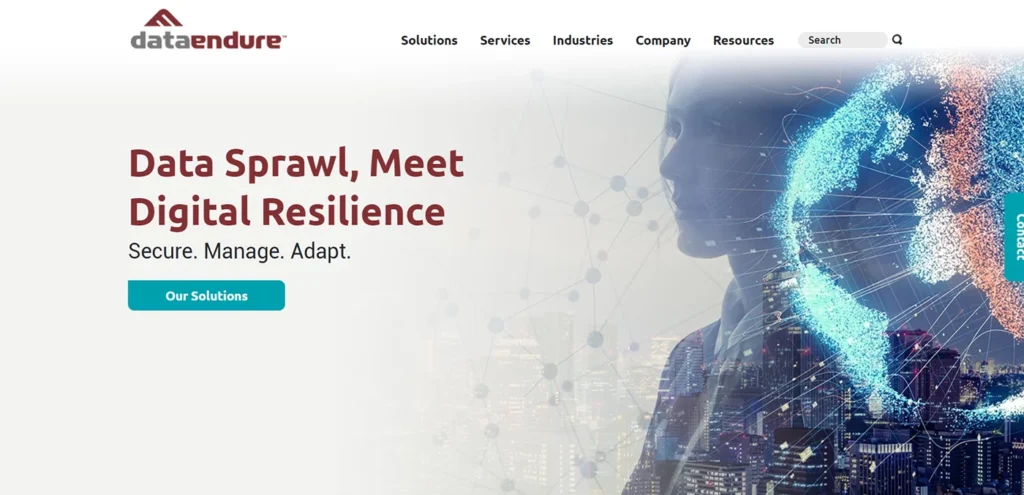
Data Endure helps businesses store, protect and manage their data with numerous high-performance solutions. Data Endure’s website has dedicated pages for each of their solutions.
Each solution page has a high-quality design layout in order to create an engaging experience, regardless of which solution a visitor is reviewing.
8. Use Captivating Videos & Imagery
Video is a powerful way to engage visitors and share stories on a website. There are a couple of ways to incorporate video into a B2B website.
One place is in the hero image of the home page design. The “hero image” is the term for the main space above the folder on the home page and it is typically the first thing a visitor sees on your site. When considering a video or image for this area, you don’t have to pick something literal. Tie the video or imagery into your value proposition and overall story. However, be careful to not select a video that has too much movement and distracts visitors.
Another great place for video is on the website About page. The About page is typically the 2nd most visited page on your site and prospects want to see your team there & know who they are working with.
Lastly, elevate your blog posts and resources with video blogs. A video blog can simply be your team talking about a topic or sharing a resource. By sharing in video and written content, you can increase the chances of engaging visitors.
Spotlight Site: Biocanic
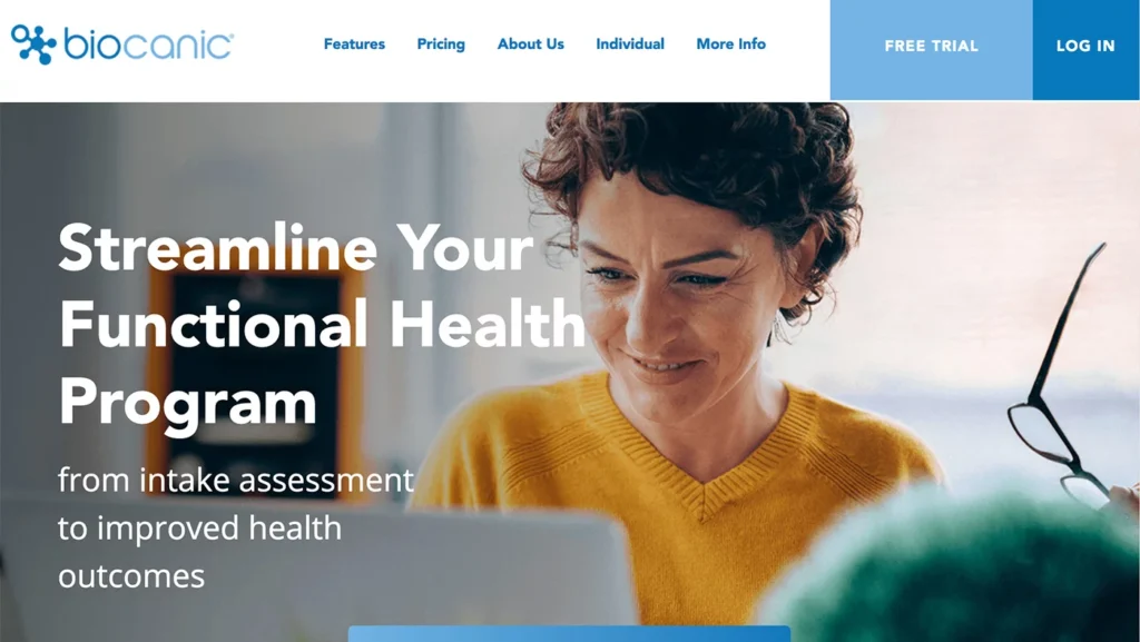
Biocanic offers a complete functional health management platform that allows practitioners to streamline & automate the end to end client experience and scale their business.
On their website, Biocanic incorporates captivating imagery and high-quality screenshots of the Biocanic management platform. Under Features in the top navigation, there is a dedicated page for the main platform features. Each of these pages have an iPad tablet with a relevant screenshot from the platform, along with lifestyle imagery & custom iconography.
All of these elements visually educate web visitors on the key differentiators of the health management platform and guide visitors to request a demo.
9. Focus on Speed & Security
Speed is an important part of a visitor’s website experience. If your website takes ages to load, a visitor will bounce quickly. When building or redesigning a B2B website, make sure your development team is considering performance throughout the project.
Your site page load time can be impacted by numerous things, such as the platform the site is built on, your hosting server, the images and videos on the site and the overall development practices.
Unfortunately, website security is also now a concern for all site owners. In terms of trust, security trumps everything. If a web visitor doesn’t feel safe navigating your site, then you can expect them to leave and not share any information. If you have a WordPress site, security is even more important since the platform is heavily targeted. Consider investing in the following security measures:
- monthly maintenance for plugin updates & WordPress core and theme
- 24/7 security monitoring
- SSL certificate
- Daily Backups of entire site and database
- Secured WordPress hosting service
Spotlight site: Jamis Software Company

Jamis, an ERP software providers, places a large emphasis on the security and performance of their website, knowing that a not secure web presence can create the wrong impression to customers.
In addition to security protocols, Jamis has also implemented best practices for GDPR or Global Data Protection Regulations. Data privacy and collection is a major concern for consumers, so these best practices also demonstrate to web visitors that the business cares about protecting their customers’ data.
10. Provide Engaging Resources on Your Website
Engagement is one of the most important factors for a B2B website. Think back to your different visitor types and their motivation on the site. For B2B websites, a lot of web visitors will be looking for resources, case studies and white papers. By offering informative content, you can meet those visitors’ needs and present your team as experts.
Case studies of your service or product success stories are also a great way to establish trust and credibility. In the case studies, focus on the customers and the value they received from your product or service versus presenting a success story of your team. Remember that visitors are looking for other customers to relate to.
Lastly, if you are using a content management system like WordPress, use the blog post technology to organize and categorize your content for visitors. The blog page doesn’t need to be referred to as a “blog.” It can be Resources or News, but you can use the post technology to organize posts into categories and chronological order. While you want to offer lots of resources on the site, a blog is a better presentation method. Avoid adding tons of pages of content in your top navigation. Reserve your top navigation for the most critical pages of your site.
Spotlight Site: Teledirect

You’ll find tons of engaging resources on Teledirect’s website. In addition to the blog, Teledirect has individual industry pages for their 4 major customer segments. Each industry page has information relevant to that audience, in addition to a case study and downloadable resource relevant web visitors can find individual case studies and downloadable resources on each of the industry pages.
B2B Website Design Tips
Work with Professionals
A common concern when redesigning a website is how the new website will impact your existing marketing and brand equity. Before embarking on a website project, do your research and find a trusted web team that is very experienced in B2B websites.
It takes three critical skills to create a successful website project : web strategy or user experience strategy, web design and web development. It’s very rare to find a single person that is the best at all these skills. A professional web designer can make sure to maintain your brand equity and integrate the above best practices for visitor engagement, interactive designs, and content into the site.
A professional web team will also follow best practices for SEO in terms of redirects, in addition to delivering a site optimized for mobile and performance.
Create a Clear Scope of Work
When discussing any website plans with your design and development team, be as detailed as possible.
Even for small size projects, an experienced web agency should ask a series of questions and present a detailed estimate for cost and timeline. If you are working on any complex functionality on the website, make sure the development team evaluates your existing website before quoting on the work.
A lot of B2B businesses have existing websites with a large amount of content, in terms of white papers, past blog posts, and press releases. Redesigning a large content site can be a challenge as someone will need to review all of the existing content and decide what stays and what is removed on the new site. In these situations, it can be very helpful to work with a web team that will help you strategically plan the navigation and information architecture, so you aren’t losing valuable content pieces in the redesign.
Set Reasonable Expectations
When investing in website teaks or a full site overhaul, have realistic expectations for the timeline and results. Redesigning a B2B website typically takes between 3-4 months at minimum. While you may be able to trim the timeline here and there, be careful pushing for a quick turnaround as you’ll end up cutting corners and quality.
When launching a brand new website, some marketing professionals and business owners can mistakenly expect the site to rank at the top of search engines and the leads to flood in after the launch date. An effective B2B website design is like the center of a wheel. The website will be the hub of communication and marketing, but you’ll need to continue to build up “spokes” or marketing channels that feed traffic into the site. Your hard work on the website and marketing will pay off, but it can take time.
B2B Website Content & Marketing Tips
Content marketing is an important strategy for B2B businesses. Since the buying cycle is longer for a B2B purchase, you want to provide resources for potential buyers and use content to keep existing customers engaged.
Creating a Website That Supports Your Marketing
When designing a B2B website, make sure to communicate your marketing goals and campaigns to your website partner. If you are planning to do a lot of content marketing, make sure the functionality and design of the site support those efforts.
1. Blog or Resource Area on the Website
We’ve already discussed the importance of having a blog or resource area on your website. This can be utilized for blog posts, press releases, news updates etc.
A lot of websites utilize a default template for the blog page and individual blog posts. Consider upgrading the design of your blog to a custom layout if you will be producing a lot of content for marketing campaigns.
You can improve the overall user experience by adding features like a search bar, related or suggested posts, categories, and calls to action for an email newsletter sign-up or gated content piece.
2. Email Newsletter Sign Up Forms
Email marketing is an excellent strategy for lead generation and building relationships with your customers. A B2B website will often have different conversion objectives and one objective can be to educate visitors.
You can set up a newsletter sign up form on the blog/resource page or throughout the website, depending on your site structure.
When building a new website, you’ll want to make sure that the website platform can integrate with your email provider. For instance, WordPress does integrate smoothly with popular email services like Mailchimp and Constant Contact, but a web design team may need to assist you in the integration setup.
3. Optimize Your Articles & Content
Publishing content regularly on your website is a great strategy for SEO as well. The search engines tend to favor larger sites with tons of content.
You can also utilize different resources on your website to optimize blog posts. For instance, Yoast SEO is a free WordPress plugin that offers numerous tools. Once installed, you can use the Yoast toolbar in the backend and get recommendations to optimize an article for a specific keyword.
Utilize these tools to get the most out of your website and content marketing efforts.
4. Tracking & Analytics
Google Analytics is the most popular, free option for tracking traffic and conversions on your site. Make sure that the proper tracking code is set up on your site. It’s best to also review any analytics reports every 30 days and spot any tracking issues.
You may have additional tracking codes on your site for Facebook, Google Adwords, or other analytic platforms. When redesigning your site, make sure all of these codes are carried over to the new site. It can be easy to miss these in the site’s header or footer code.
5. Website Forms & Notifications
If you are utilizing Google Analytics, you can also set up goals or events to track conversions through website forms on your site. Make sure that you are reviewing your website forms and checking the tracking for each one.
You’ll also want to check on the website form notifications for your site and make sure all the notifications are going to the proper email addresses. You can also work with your web design team to integrate any website forms with a CRM.
